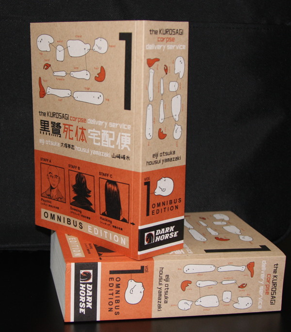
We’ll be talking about this title in more detail next week, but for now I just wanted to show you a photo of what the first book in The Kurosagi Corpse Delivery Service Omnibus Edition looks like…because just showing you the front cover image wouldn’t really suggest what sets it apart from the regular edition—the sheer physicality of it. The idea behind an omnibus is, of course, to collect a lot of story together—but stack up all the flatness of those hundreds of sheets of paper, and suddenly a medium often described as two-dimensional has now very much acquired a third. For the Kurosagi omnibus, we wanted to take advantage of it to re-express one of the series’ most distinctive aspects: its cover design.
It’s not unusual in Japanese manga publishing to employ outside cover designers. But usually the work of the interior artist remains the cover’s dominant feature; for example, the cover for Panty & Stocking with Garterbelt was designed in Japan by studio Imagejack, arranging TAGRO’s drawings of the title characters amid a complex pattern of shapes and colors (the multilayered, Japanese-formatted files were a bit tricky to reproduce for the English version, yet thanks to designer Sandy Tanaka and print buyer Heather Doornink, it was done ^_^).
The Kurosagi Corpse Delivery Service is different. The manga’s interior artist, Housui Yamazaki, contributes the character headshots in the lower third of the book—but the rest of the cover is dominated by the work of its designer, Bunpei Yorifuji. Like Satoshi Kon and Hiroki Endo, Bunpei Yorifuji is a graduate of Musashino Art University. In 2008, he won Kodansha’s annual award for book design (past winners have included the internationally famous artist Tadanori Yokoo); that same year, Yorifuji became known to millions of riders on the Tokyo subway through his “Do It At Home” ads to encourage considerate behavior by commuters.
But Kurosagi creator and writer Eiji Otsuka was ahead of the crowd, getting Bunpei Yorifuji as the manga’s cover designer back in 2002, when its first volume came out in Japan. Yorifuji has created every cover of Kurosagi since (as well as the covers of several other series by Otsuka). Brennan Thome, the designer of our new omnibus edition, has taken advantage of the new “surface” the omnibus presents—its spine—to feature Yorifuji’s design elements in a revised arrangement. And that’s especially important because we want more people to check out this manga; going along the bookshelves in a store, the spine may be the only part a person sees.
The solid look of the Kurosagi omnibus is reinforced by its cardboard cover stock. This is another way that Dark Horse has tried to re-express Yorifuji’s design ideas. As you may know, unlike the way manga or graphic novels are typically published in North America, where the cover art is printed on the cover itself, in Japan the cover art is usually printed on a separate, removable dust jacket (this custom of using dust jackets on paperbacks is common in Japan but rare here). The original Japanese edition of Kurosagi extends its design sensibility even to the “stock” (material) used for the dust jacket—Yorifuji had the art printed on a jacket made out of brown wrapping paper, to suggest the “delivery” aspect of the story.
We wanted to include this tactile element in the English edition of Kurosagi as well, but wrapping paper would rip off pretty quickly if you tried to use it as the cover of an American-style paperback. Instead, we expressed the delivery theme by printing Yorifuji’s art on brown cardboard. With the omnibus dimensions, the effect is almost like a book-shaped box…and hopefully a copy will be on its way to you soon! We’ve had all this to say just about the cover of The Kurosagi Corpse Delivery Service Omnibus Edition Book One—we’ll get to what’s inside next week! ^_^
—Carl Horn
Manga Editor