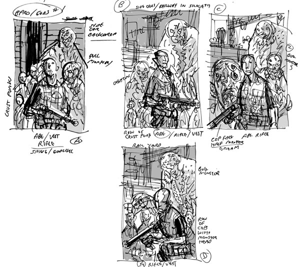
GUY DAVIS: I drew a few initial sketches for the first-issue cover, mostly Abe in an action pose with monsters and the punks behind him. John wanted to mix it up from the feel of some other covers we did and came up with the idea of Abe standing and looking out at the reader in front of a transforming monster.
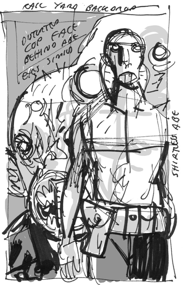
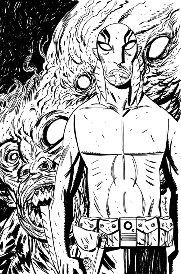
GUY: The finished inked cover based on John’s idea was pretty much the same as my sketch.
JOHN ARCUDI: My idea was to have him ominously (or more precisely, boringly) standing there, and then Scott suggested the cutaway and labels.
SCOTT ALLIE: Abe’s pose was so neutral; I got to thinking of one of those old anatomical drawings. John and Guy and Mike and I went back and forth on how to do the text—it was between Latin and Frog, and Frog won because it was easier to fake than Latin. It meant dropping the background way back, so the text would be able to sit on it.
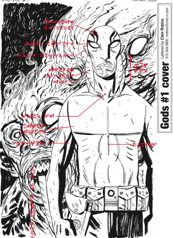
DAVE STEWART: This is a JPEG of the image before we thought of the overlay of guts.

GUY: Dave had the great idea of adding in a layer to make it an anatomical drawing. This separate drawing was a lot of fun. I didn’t put too much thought into what was inside of Abe except for where his fins connected. So I just drew a bunch of bizarre-looking guts off the top of my head.

DAVE: I got the innards part and at first thought I would do a cutout, but Scott wanted to try the transparency layering first. He was referencing the giant 1914 Dutch science posters I have hanging over my desk. That worked perfectly.
JOHN: That layering was Scott's idea. I remember Scott and I were talking and we brought up the visible-man bit and I went looking for appropriate colors for the organs.
GUY: Now that’s teamwork and proof why Dave’s the best!
