For the logo, we wanted something very deliberately evocative of both traditional fantasy logos in general and fantasy MMORPG logos in particular, but with a subtle nod to the science-fiction tinge of the story. Designer Dave Nestelle took that idea and ran with it.
The cover itself was more challenging: we had to find a way to sum up, with one image, a humorous fantasy novel whose protagonist is a rapidly-decaying NPC in a massively-multiplayer online game.
Art Director Lia Ribacchi and I came up with the following guidelines. We wanted a cover that:
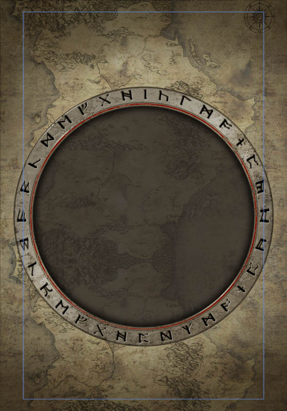
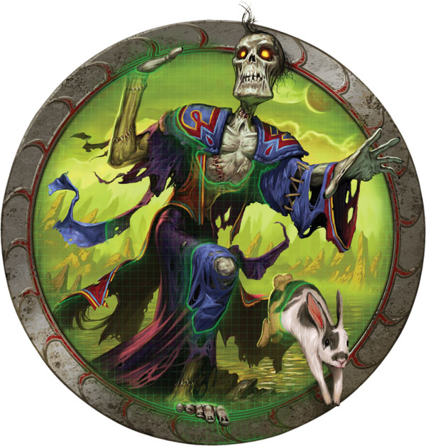
The plan we settled on was a very deliberate--and, we hoped, instantly recognizable--nod and wink to the behemoth of MMORPGs, World of Warcraft. Like WoW’s, Mogworld’s cover would be stone-textured, with a circular window framing the art. We wanted Jim himself front and center, overlapping, trying to escape from, or otherwise interacting directly with the framing.
The next step was finding an artist. We wanted someone who worked in an accessible fantasy style, and, most critically, could make an ugly character appealing without making him cute; with Matt Cavotta, we hit the jackpot on both fronts.
Matt started with the frame. His first design used runes, which we ultimately vetoed because the veered a little too close to the actual WoW covers--we wanted to evoke them, but not to reference them so closely as to confuse readers. Matt switched to the crescent-shaped thorns that you’ll see on the actual cover.
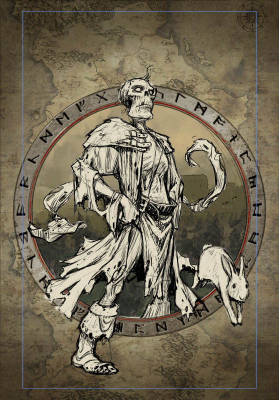
Here’s Matt’s first sketch of Jim--in his words, “a pose that was all pomp and bluster, but with a pencil-necked and tattered zombie,” a tongue-in-cheek play on just how far Jim is from the traditional fantasy hero. The pose didn’t stick, but Matt’s version of Jim--and the rabbit, which is both a character in the book and convenient visual shorthand for “this one’s going to be funny”--did.
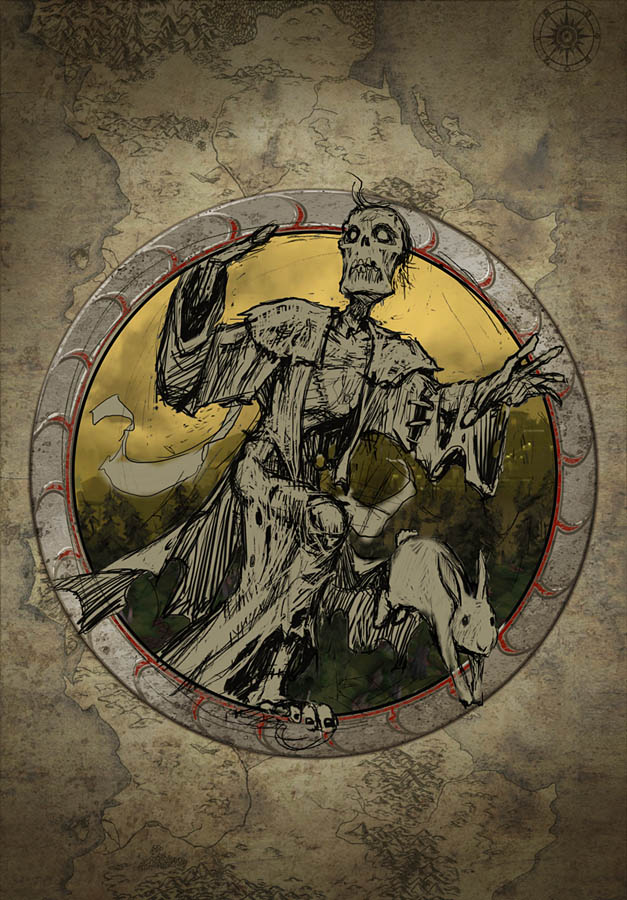
And here’s the sketch that became the final cover. Matt really knocked this one out of the park. I particularly love the way the angle and expression of Jim’s face imply that he’s looking up at the reader. It’s the perfect Truman Show reveal, where the main character suddenly realizes not only that his world is a stage, but that there’s an audience.
The final cover art added a subtly digital membrane over the circle, which further plays up the game world / real world divide.
And here’s the final, designed cover.

Mogworld is in stores now! Stop reading this and buy a copy!