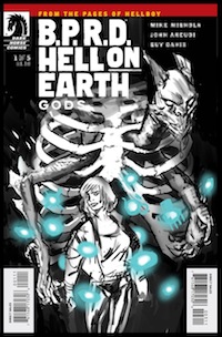
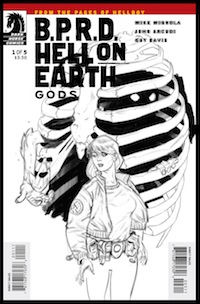
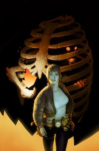
We asked Viktor Kalvachev to give us a glimpse behind the curtain at his process for the new cover of the new B.P.R.D. two-parter Exorcism. Take a look below at his process and find out what it takes to create something with a touch of eerie to it. Be sure to pick up a copy of #1 when it hits shelves at your local comic ship on June 27th. 32 pages of Awesome!
1. Step 1: Sketching. When I do a cover, my approach is always to first find an interesting visual question that illustrates the story inside and provokes the reader to want to know more. I liked the setup of misleading the main character and went for that. In the first sketch I showed the demon as a prisoner in a cell, seducing the inexperienced guard with shiny objects, while plotting an escape plan. What I didn't like was how the head was sticking out too much and the rib cage could also be read as an outfit, rather then a prison. The demon had to be clearly behind bars for this to work, but the idea was solid. It was also important we didn't reveal its face on the cover.
I always like to design a cover while keeping in mind everything that's going to go on it from the very beginning—logos, barcodes, names, etc. This way, I am never surprised by having to move an important object somewhere else, because it's covered up by the price, for example.
(Click Image to Embiggen)
In the second sketch I went for a pure, classic action shot. Mike and Scott liked it for the second cover, so I kept it.
2. Second stage is pencils—making sure I am on character and everything is readable as silhouettes and details. As you can see, the logos are still there to help me make sure all the elements work well together and complement each other, rather then fight for attention.
The moment I hid the demon inside, the whole thing worked. I also got rid of the many shiny flames and concentrated on only one, but then I felt the elbow and flame were not standing out well enough because they blended with the rib cage a bit too much.
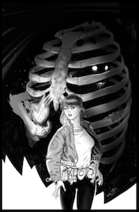
3. Stage 3 is values—making sure I use dark and light areas to play with importance and contrast between the key storytelling elements on the cover.
The problem at this stage was that the connection between the demon and the girl was too direct, and I wanted it to be more vague. Maybe she should be only catching it with the corner of her eye, not so easy to spot…More like daring the demon—catch me if you can? At this stage I no longer need to have the logos and names visible, but I do check once in a while to make sure the balances are all right. I also fixed the arm and now it reads a lot better.
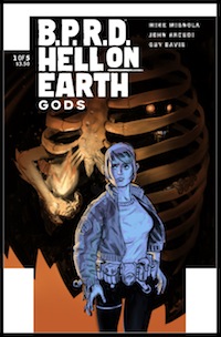
4. Stage 4—almost there—now the girl is looking ahead, noticing something behind her, and the demon is happy his plan is working. She looks a bit scared here (rather then curious), so I planned to work later on her expression to match the character in the story better. I have also decided on my basic color scheme.
5. Rendering—it's the final sprint line, where I play with details, pushing some back while pulling others to matter more. I had the face and arm of the demon in more detail, but decided to tone them down in favor of the girl. I also managed to add a little joke as a tribute to Mike with the very 2-D flame, Mignola style. :) by Viktor Kalvachev
