The Last Dragon is out this week, a beautiful book by master storyteller Jane Yolen with gorgeous art by famous artist Rebecca Guay. This book harks back to a style that has not been seen for a while. You won't find anything more enchanting than The Last Dragon on shelves now.
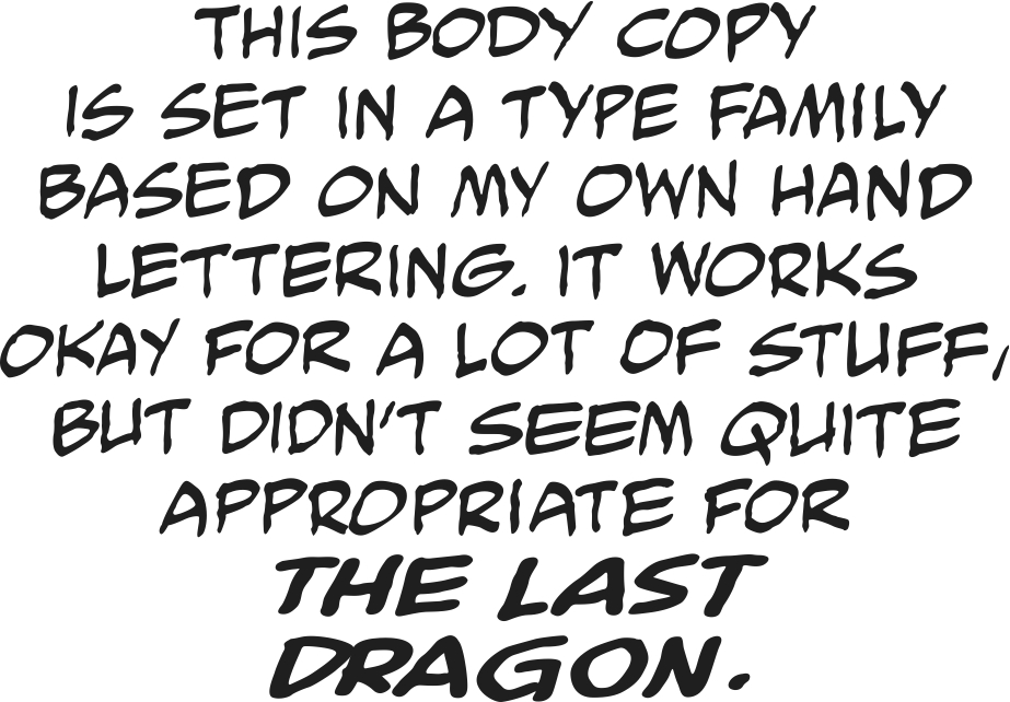
I’m not what you’d call a stylist. In almost thirty years of hand lettering, I developed what I think was a brisk and readable style, and used it as best I could to help tell stories, while calling as little attention to the lettering as possible. In my past eight years of doing mostly computer lettering, I’ve tried to just replicate my hand lettering, and make it hard to tell it was done with a keyboard and not a pen. I’m no more compelled to shape letters differently than would be, say, John Costanza when he would letter on John Byrne instead of Herb Trimpe. The lettering stays in the background. My digital body copy usually looks like this:
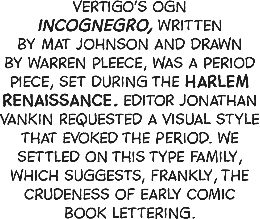
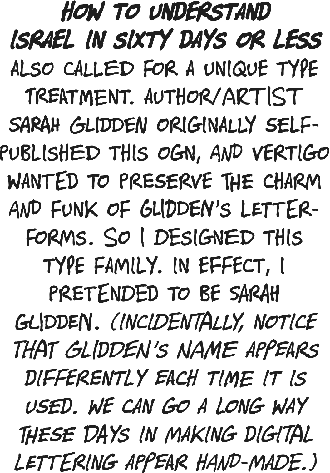
But there are exceptions. Incognegro: [fig. 2] and How to Understand Israel in 60 Days or Less: [fig. 3] were projects that required me to pretend to be someone else. The former wanted a style that evoked the crude lettering of comics of the 1930s. For the latter, I designed a family of type which would resemble the artist, Sarah Glidden’s, own hand lettering. These are the sort of things that digital lettering does wonderfully well, and especially so if you insist on designing all of your own type. In effect, you’re acting. It’s kind of fun.
[Fig. 2]
[Fig. 3]
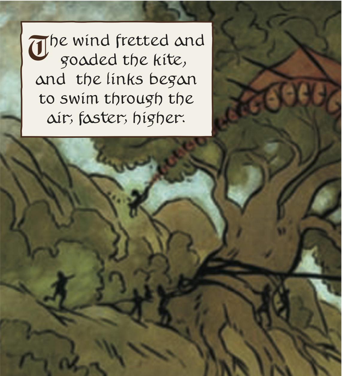
The Last Dragon was another such exception, and a lot of fun. It was a chance to match the whimsy of Jane Yolen’s script and the lovely Deco-inspired watercolors by Rebecca Guay. Editor Rachel Edidin had ideas for how the lettering should look, but she ended up contributing more than just ideas. More about that in a minute. But Dragon was clearly a very special project. The challenge was to change my whole visual approach to flow with theirs. Fair enough. I get a nice page rate, and a 135-page graphic novel is a big enough project to justify the time needed to design whole new families of type.
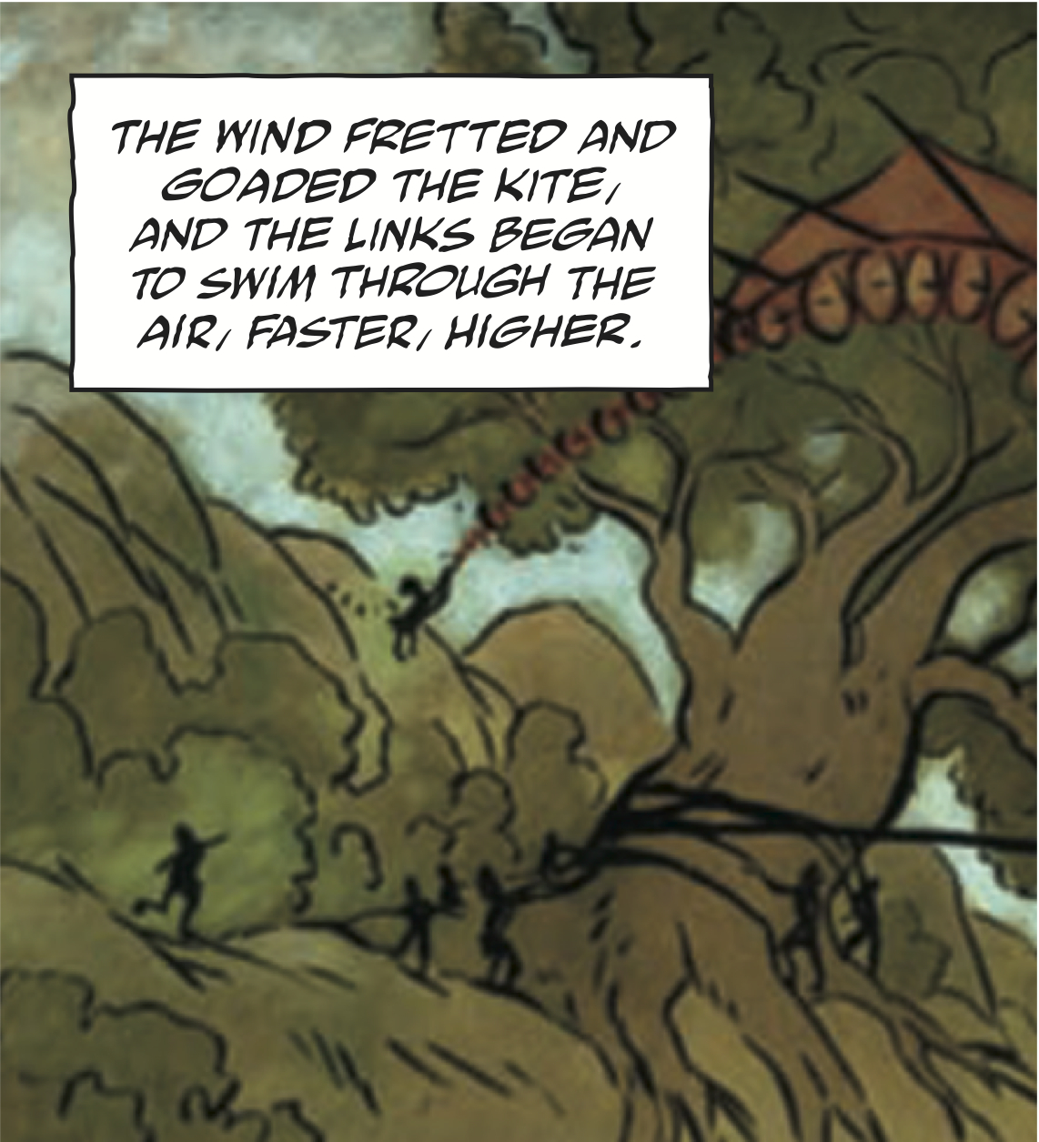
For perspective, here is a panel of The Last Dragon relettered using the body copy type family I normally use: [fig. 4] It seemed out of place on fully painted artwork, and didn’t fit in with the storybook feel of the script. For the caption work, Rachel suggested something that would evoke medieval calligraphy. Rachel actually is a calligrapher in civilian life, and I’ve designed fonts based on her work in the past. So I asked her to try drawing a few alphabets for me, to see if I could turn them into type suitable for The Last Dragon. This was done, and the letterforms you see in the captions are entirely hers. Here’s the same panel, using the faux-calligraphic family of fonts: [fig. 5]
[Fig. 4]
[Fig. 5]
I think it worked nicely. Rachel’s alphabet not only suggests calligraphy, but even more specifically, calligraphy executed by a woman. (Calligraphy-Nerd Aside: The hand I designed for this book is based loosely on 9th century Carolingian—a style developed in an era when writing was almost exclusively the province of men. -Rachel) Last Dragon was written, painted and edited by women, and there’s a girlish feel to all of it. Having a feminine quality in the caption work just seemed to make sense. The leader characters in the caption blocks were made using the Old English font which seems to wind up in most computers these days. Normally I try to avoid using any type which I myself did not design, but here, it seemed to work.
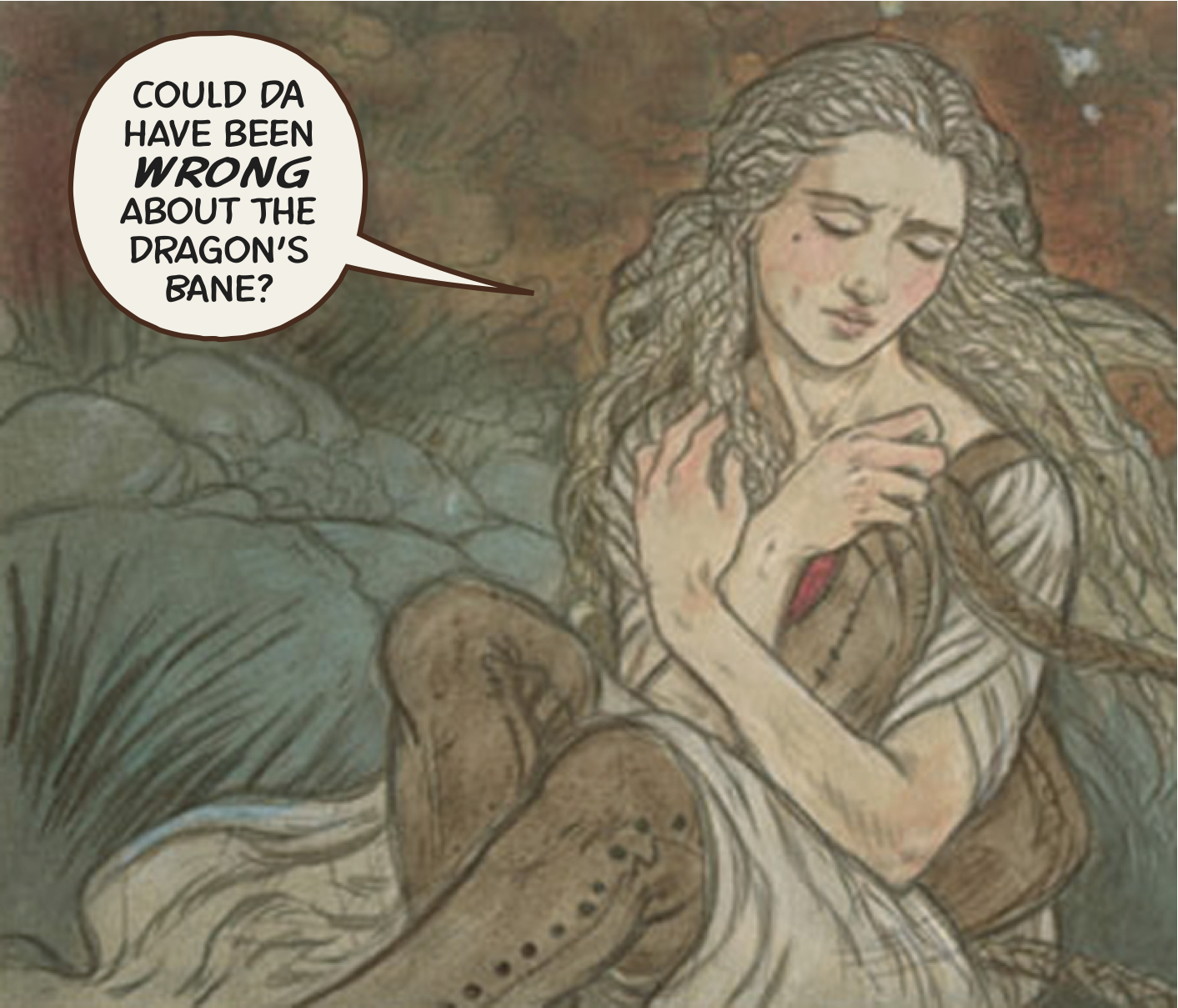
For the dialogue, we also wanted something offbeat. I had attempted to design a new type family for use on Eduardo Risso’s artwork. The new fonts were an attempt to match Risso’s pen line, but it never really worked. However, it fit right in for the dialogue in Last Dragon; the right angles upon which the letters are built, and their unvarying line weights, had a childlike quality about them (which is probably why they looked lousy on Risso, whose work is many things, but certainly is not childlike). And a wiry, unvarying line is a mainstay of Art Deco, so similarly weighted lines suited the visual feel of the project. [fig. 6]
[fig. 6]
Test sheets went back and forth, as we finalized things like point size and the colors used for balloons and captions. The kind of time and care which is almost impossbile on a monthly book is more than justified on a graphic novel. By the time these decisions were made, lettering the book was a pretty simple process.
If you add it all up, my participation only occupied a few days of my life, while the author, artist and editor lived with this thing for years. My contribution was relatively minor and came late in the game, but I tried to serve their purposes, and I hope I was able to add something. I’ve had extraordinarily good fortune in the projects I’ve been associated with, and the people I’ve been privileged to work with. The Last Dragon, and Jane, Rebecca, and Rachel, are as good as it gets.
