Our Design department is an integral part of our process here at Dark Horse Comics. Their work is consistently outstanding, always surprising and new. We asked them to talk a little about the House of Night logo, which took a little bit of work to get something that worked. The indomitable Tina Alessi took on the House of Night logo for us.
Logos are tricky things. Especially logos for comic books. Not only do they need to be quickly identifiable and just as legible as any other branding mark, but a comic-book logo has the added responsibility of embodying the personality of its title—however bold or subtle that personality may be. To help accomplish this for House of Night, editor Sierra Hahn and assistant editor Jim Gibbons did their best to paint a vivid image of what they were aiming to deliver in this series, as well as indicate a few specifics of what they were hoping to see (and not see) brought to life in this logo.
We were after something modern—not gothic or historical—that felt young and fresh and could imply "sexy vampire school" while at the same time maintain an essence of the traditional and academic entity that the House of Night is. A design something like Gossip Girl meets Buffy the Vampire Slayer that would appeal to that audience as well as readers of the novels. That meant a design that would include elements of the tattoos that come to mark the characters of the series and would incorporate the crescent moon used on the novel covers.
I started with a handful of rough sketches, trying out letter forms and exploring ways to incorporate the crescent-moon icon and tattoo elements.

The feedback on the first round was that the logo was on track, but feeling overall too small and constricted. I created a stacked version so that the logo could sit larger on the cover, and focused on rounder letter forms to convey a more airy appearance. Opening the top of the letter O added to the airy quality and simplified swashes allowed for a subtle movement to flow between letters. These two elements became the basis for the final logo.

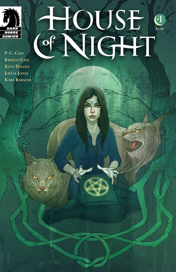
The final logo on the cover of issue #1.
by Tina Alessi
Graphic Designer