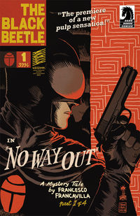
First, a word from Jim Gibbons, editor of THE BLACK BEETLE...
A little backstory…
After The Black Beetle’s successful run in Dark Horse Presents ended, Francesco and I began discussing how to proceed on a Black Beetle miniseries. I threw out the idea of bringing a letterer on to the book to help with the workload. Between writing, drawing, inking, and coloring, not to mention doing a hefty portion of the design work and promotion for The Black Beetle, it just seemed like the lettering might get shortchanged due to the insane amount of responsibilities Francesco had taken on with this project. We both agreed that bringing someone on to really make the lettering as unique and incredible as the rest of this book would help us deliver the best comic product. Naturally, Nate Piekos immediately jumped to mind.
Working with Nate is always a pleasure and, after seeing how well his lettering had worked with Eisner Hall of Fame inductee Richard Corben’s recent adaptations of Edgar Allan Poe stories in DHP—modern, yet classic, with tons of personality and style—I knew he’d be able to construct an amazing font for The Black Beetle, and after seeing a few samples, Francesco enthusiastically agreed.
I’ll let Nate take it from here…
(click any image to embiggen)
A few months ago, word came from editor Jim Gibbons that Francesco Francavilla’s The Black Beetle was going to get its own miniseries, and Jim wanted to bring a letterer on board. I’d seen The Black Beetle in Dark Horse Presents, and started brainstorming before I’d even replied to the e-mail. One of the things I love about working with Dark Horse is that they trust me to come up with a new style guide for the lettering of each new project. It’s one of my favorite tasks.
I have an extensive reference library in the Blambot studio that covers every period and genre of comics and everything design related: movie posters, graffiti art, wine labels, medieval penmanship, you name it. So, I pulled everything I had related to the pulp detective hero genre off the shelves to get in the right mindset for the task ahead.
It’s one of my primary goals to make the lettering complement the art I’m lettering over. Doing this is all instinct and experience, but it helps that I design all my own typefaces.
As I always do before a new series, I sifted through fonts I had already completed, and chose the bits and pieces of fonts that sit in a special directory on my hard drive that were pertinent to this project. This is where all my fonts start life. I’ll have an idea and make some quick sketches using my Wacom Cintiq and Photoshop or Illustrator. Most get tossed out, but about a quarter of them make it all the way to availability at Blambot.com.

I discovered some sketches I’d done a few months earlier that were close to what I was envisioning. The design would need to complement the genre, but more importantly, complement Francavilla’s artwork. I think I even showed the roughs to Jim at that point—just a few letters and some random punctuation—to make sure I was on the right track.
I got to work right away on the font that would eventually become Blambot’s Tough as Nails BB. Since I try to come up with two new fonts every month, I was killing two birds with one stone—the perfect font for The Black Beetle’s dialogue and a new font for public release.
I remember making one solid pass at a finished design, showing it to Jim, and taking a day or so away from it. When I came back with fresh eyes, I realized the “pen style” was wrong.

The letterforms worked, but instead of a uniform Rapidograph style, the font would be even better if I made it look as if it was lettered with a calligraphy tip. To go one step further, I reversed the angle that most comic hand letterers hold their pens at so that the vertical strokes were thicker than the horizontal. This is not a matter of pushing a few buttons in AI; it meant reworking each letter individually. Meanwhile, the clock was ticking and I had to start lettering the pages coming in!

A week or so went by while I juggled lettering projects and snuck in as much time as I could on the dialogue font. I’d gone from Illustrator to FontLab, where I turned it into a working font family, refining, spacing, and kerning every character with every other character—thousands of letter combinations accounted for! Italic, bold, and bold italic were extrapolated from the regular version. The design was unconventional but perfectly legible, and it had a lot of character. (Pun intended.)

I lettered some sample pages for Jim and Francesco, then started brainstorming the other important elements, like colors, caption styles, and the supporting fonts.
The panel gutters on Francesco’s art aren’t white. This potential problem became a cool style element for my lettering. Sure, I could make the balloons white, but they’d be the only white elements on the page—too obtrusive. I borrowed the washed-out gray of the gutters for all the balloons, and chose to break any balloon that butted up against the panel border—break them into those gray gutters.

My first idea for BB’s captions was a modified version of what Francesco had previously done. But then I thought I’d borrow the color from his chest emblem for the caption boxes and place a small beetle logo either behind the text, or at the top left corner.

Based on the initial lettering he’d done on a Black Beetle ashcan a few years back, Francesco suggested some Alex Toth influence, and we decided all of BB’s captions would begin with a pronounced letter set against a black circle, similar to a drop cap.
On any book with brush inking, I like to make sure all the balloons and captions have an organic thin-thick-thin variation to their line weight. This was thrown into the mix, as well as slightly irregularly shaped balloons and caption outlines, making The Black Beetle’s lettering look less computer perfect.

Lastly, to differentiate the location captions, like “Meanwhile…” and “Later that night…” from BB’s monologues, I picked a font I’d developed a few years ago called Snake Oil Salesman BB. It looks like gummed-up, old typewriter text—perfect for this pulpy series!

The DHP material—The Black Beetle: Night Shift—was originally lettered by Francesco, but I was brought on to reletter it for the one-shot and eventual trade paperback collection so the lettering in The Black Beetle would have a sense of continuity. Originally printed in eight-page installments, Night Shift had recap panels that now needed chapter headers. For these I wanted a heavy slab font, and Trash Cinema, a font I’d finished just a week or so before, looked perfect. Whenever the chapter headers appear, their color changes based on the color palette of the panel they’re in.

Since Francesco lettered most of his own sound effects right on the artwork, I would only be responsible for the odd additional effect here or there.
With the sample pages in their final incarnation, I sent them off to Jim and Francesco and kept my fingers crossed that they’d like them. Both of them were pleased that the style guide I’d come up with not only fit the book well, but also enhanced its pulp feel.


—Nate Piekos